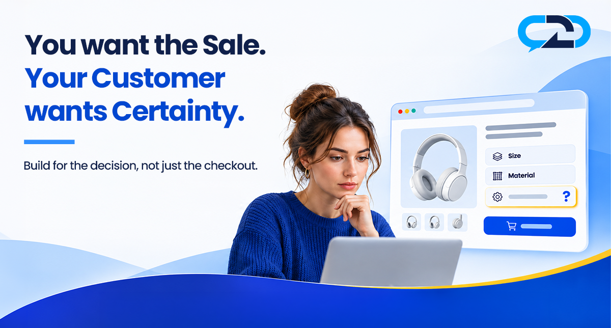
Most ecommerce teams ask a familiar question: how do we get more visitors to buy?
The shopper is asking a different one: am I ready to?
Those questions are related, but they are not interchangeable. A store can make its purchase button more visible, shorten its checkout and bring in more traffic. A shopper may still pause because they do not know whether the product is right for them, what they are agreeing to, or what happens if something goes wrong.
That pause is easy to mistake for resistance. It may simply be the customer doing the work of making a decision.
A business wants a sale. A customer wants enough certainty to decide whether the sale makes sense for them. The strongest shopping experiences make room for both.
A smooth path is not the same as a confident decision
Imagine a shopper looking for a desk for a small home office. They have found one they like. The price is within budget. The photos look good. The checkout button is right there.
But they are not sure whether their chair will fit underneath. They want to check the clearance, not the overall height. The page gives one measurement but does not say what it describes.
The business sees a visitor who has not added the desk to the cart. The shopper sees a decision with an unanswered question.
The difference matters. A brighter button does not supply the missing measurement. Another email asking the shopper to complete a purchase does not tell them whether the desk works in their space. Those things may have a place in a broader marketing strategy, but they address a different problem.
This example is illustrative. Not every visitor who leaves has a question, and not every unanswered question leads to a lost sale. People compare prices, save ideas, change plans or browse without intending to buy. The point is not to explain every departure with one theory. It is to recognize that a smooth route to purchase and a well-informed decision are different jobs.
A useful question for any team is: if a customer is interested but not yet sure, what can they do next besides buy or leave?
When the business asks for commitment too soon
Consider an ordinary checkout decision: whether to create an account.
An account can be useful. It can make a later purchase easier, help a customer see previous orders or save information they choose to keep. For a business, it can support a continuing relationship. None of that makes the account inherently bad.
The timing is the issue. A first-time shopper may have arrived to complete one purchase. If they are asked to consider an account before they can finish, the business has introduced another decision at a moment when the shopper is focused on the order.
In its checkout research on account creation, Baymard Institute observed that invitations to create an account before or during checkout caused some participants to hesitate or interrupt their progress. Its recommendation is to offer a clear guest path and save the account invitation for the confirmation step. That is a finding about a particular checkout design choice, not evidence that every account prompt causes abandonment.
The broader lesson is a useful one: a step that serves the business can be reasonable and still arrive at the wrong moment for the customer.
Before adding a request, ask what the shopper is trying to accomplish at that point. Does the request help them do it? Is it necessary now? Can the same business objective be served later, after the customer’s immediate goal is complete?
Certainty is not the same as persuasion
The word certainty can sound like a demand for a guarantee. In practice, shoppers often need something more achievable: accurate information, clear expectations and an honest way to resolve uncertainty.
A shopper considering a jacket may want to understand the fit. Someone choosing an appliance may need to know its installation requirements. A person buying a gift may want to understand the return policy before committing. None of these questions is a request for a sales pitch. Each is an attempt to judge whether a purchase suits a particular situation.
Persuasion can show a product’s value. Certainty helps the customer assess whether that value applies to them.
Those goals do not have to compete. A strong product description can do both: explain a benefit and provide the facts needed to evaluate it. “Designed for small spaces” is a starting point. The dimensions and clearance that make that statement useful are what allow someone to test it against their own room.
The honest answer may sometimes be that a product is not the right fit. That can be uncomfortable in a conversation focused only on the current order. It is also a way to respect the customer and avoid promising what the business cannot deliver.
The information gap and the confidence gap
It helps to distinguish two problems that can look similar from a dashboard.
An information gap exists when a relevant fact is missing, difficult to find or hard to understand. A store can often address it by adding a verified measurement, clarifying what is included, or explaining a policy in plain language.
A confidence gap can remain even when the fact is available. The shopper has read it but is not sure how it applies to their particular device, room, event or budget. They may need to compare two options, check an exception or speak to someone who knows the product.
The distinction is practical. If many people ask the same question and the answer is stable, improve the page. Asking every shopper to contact the business for a basic specification adds work for both sides. If the answer depends on the shopper’s circumstances, a clear contact option may be more useful than another generic paragraph.
Neither approach replaces the other. Good product information should answer the common question. A conversation can help with the question that remains.
There are limits. A team should not guess about compatibility, stock, policies or delivery. If the answer is unknown, say so and explain how it can be verified. When a question concerns health, safety or another specialized area, the right response may be to direct the customer to a qualified professional.
A button tells you what happened, not why
Businesses need metrics. They help teams see whether people move from a product page to a cart and from a cart to an order. But a number on its own cannot tell you what a shopper was thinking.
If fewer visitors add an item to the cart, several explanations are possible. The price may be outside their budget. The product may not fit their needs. An important detail may be missing. Traffic may have come from a campaign aimed at a different audience. A technical problem may have interrupted the experience. More than one factor can be true at once.
A conversion rate is a starting point for investigation, not a diagnosis.
Pair the numbers with evidence that can add context: customer questions, return notes, search terms, usability observations and the product page itself. Look for a recurring pattern, then check it against the facts. If a number changes after a page update, remember that season, traffic, price and availability may also have changed. Avoid claiming that one edit caused the result without enough evidence.
This is not an argument against optimizing a button. It is an argument for knowing which problem the button is supposed to solve.
Make the next step match the customer’s question
A useful shopping journey does not force every visitor into the same action at the same time.
Someone ready to buy should be able to do so without unnecessary obstacles. Someone who needs a fact should be able to find it without submitting a request. Someone with a situation-specific question should be able to see how to ask. Someone who wants to leave should not have to fight the page to do it.
That may mean showing a clear guest checkout option, making policies accessible before purchase, or placing a relevant contact option near the product. It may mean improving information that already exists rather than adding more features.
A simple way to test the journey is to give a colleague a realistic task: “You need this item for your room, but you are not sure about one dimension. Show me what you would do.” Watch what happens without explaining the interface. Where do they look? What do they assume? What could they verify on their own? What do they do when the answer is not there?
Repeat the exercise with a different product and a different question. The objective is not to prove that a design is good or bad. It is to see where the experience asks the shopper to do work the business could have made easier.
A role for a real conversation
Not every decision requires a call, and a contact button is not a substitute for a clear product page. But for a question that depends on an individual’s situation, having a way to reach the business can be useful.
Context to Call places Call, SMS and Email options on a product page. When a call comes in, the team can see the product page the shopper was viewing before the call connects. That gives the conversation a relevant starting point while the shopper explains what they need.
The team still has to listen, verify the facts and provide an honest answer. A contact option does not guarantee an immediate response or a sale, and it does not resolve a poor checkout design. It gives the customer another path when the information on the page is not enough.
For the business, the important discipline is to use what it learns responsibly. If the same verified answer helps many customers, consider making that answer easier to find on the page. If a question reveals an exception, make sure the team knows the actual policy before responding.
A four-question check for your next review
You do not need to redesign an entire store to start. Choose one important product page and follow the journey through checkout. Then ask four questions.
1. What is the customer trying to decide?
Write down a realistic decision, not just the action the business wants. “Will this fit my space?” and “Can I use it with the device I own?” are different from “Add the product to the cart.” Use customer evidence where it is available, and label assumptions as assumptions.
2. What can they verify without asking?
Look for the facts needed to make that decision. Check whether they are accurate, visible and explained in a way a first-time shopper can understand. If the answer is missing, find the right person to verify it before updating the page.
3. Where does the business ask for a commitment?
Follow each prompt, from account creation to checkout. Ask whether it is necessary at that point and whether a lower-friction alternative exists. Do not remove a step without understanding its legal, operational or security purpose. The aim is to question the timing and burden, not to strip out every safeguard.
4. What can the shopper do if they are still unsure?
Check whether a clear contact path exists and whether the team has the information needed to answer. Test the experience using the actual channels and hours the business offers. If an answer requires further investigation, make the next step clear rather than inventing certainty.
Record what you find, choose a manageable improvement and revisit it after the change. Combine quantitative results with customer feedback. The point is to learn whether the experience better supports the decision, not to declare a victory from a single number.
A better question for the business
A store needs sales to survive. Asking how to improve conversion is sensible. But the question becomes more useful when it includes the customer.
Instead of only asking, “How do we get this person to buy?” ask, “What does this person need to make a decision they feel comfortable with?”
Sometimes the answer is a clearer page. Sometimes it is a choice to continue as a guest. Sometimes it is a conversation. And sometimes it is the honest recognition that the product is not right for them.
The goal is not perfect certainty. It is to stop treating every pause as a problem to push through and start treating it as a moment worth understanding.
See how Context to Call gives shoppers a way to contact a business from the product page: https://www.contexttocall.com